It's a well-known fact that effective colour usage enables you to communicate directly with your audience. Different colours provoke a range of emotions and sentiments. Once you understand these, you'll have a better notion of the colours you should employ in your home.
Because pastels evoke feelings of warmth and gentleness, it's no surprise that they're popular in the spring. Winter's severity has departed, paving the way for hope and fresh beginnings. Additionally, pastel colours, due to their reduced saturation, lend themselves nicely to creating peaceful and pleasant summery sensations.
Pastel hues are simple to include in a child's playroom or beach house - a splash of robin's-egg blue or dusty pink adds the ideal amount of whimsy and excitement. However, can these pleasant tones be used in more mature spaces? Absolutely, pastels' reputation for being childlike is a thing of the past. They are adaptable and can serve as a subtle accent or serve as the primary design canvas.
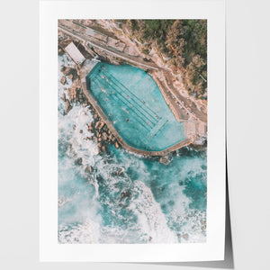
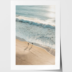
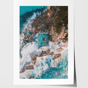
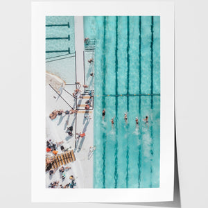
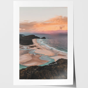
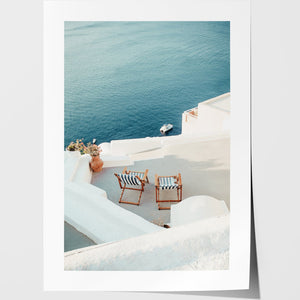
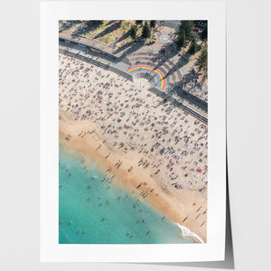
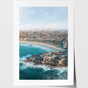
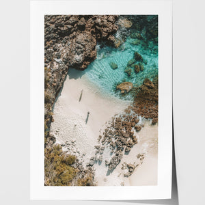
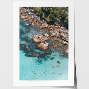
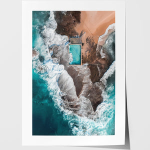
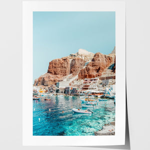
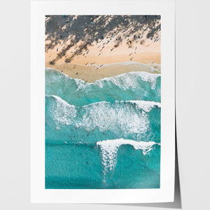
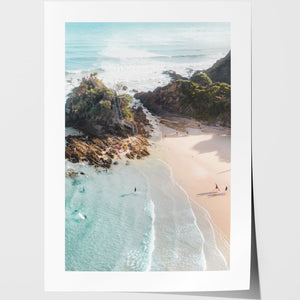
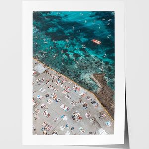
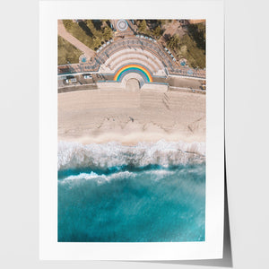
Are you looking for the perfect pastel canvas wall art ideas? You can always take a look at canvas prints online.
Types of pastel colours
A pastel colour is any hue that has just enough white to appear delicate and soft while still retaining its vibrant personality. This year's most popular pale hues were delicate millennial pink, light azure, creamy mint, and whimsical yellow.
Pastel colours are those that promote the sensation of being lighter or softer and can be found in the range of a light blue that is closer to white. Typically, pastel tones are employed to decorate children's spaces, as these colours are regarded to be less intense and, as a result of their softness, to be soothing to the majority of youngsters.
Pastels come in a variety of forms, including hard, soft, oil, PanPastels, and pastel pencils, each with its own set of features. Three primary colours (red, yellow, and blue), three secondary colours (orange, green, and purple), and six tertiary colours make up the colour wheel (red-orange, red-purple, blue-purple, blue-green, green-yellow and yellow-orange). The softened, lightened hue of these colours, specifically the primary and secondary colours, is referred to as pastel colours.
How do combine different types of pastel colours?
Isn't there something oh so comfortable about colours that make you feel at ease and welcomed into the house of a friend? Throughout the decades of interior design trends – from retro and vintage in the 1950s and 1960s to bold and bright in the 1970s and 1980s - we've always admired how colour creates an environment in our homes that we can all identify to. Pastel colours have come a long way since they were reserved for infant nurseries! Today, they provide a calm atmosphere in your living rooms, offer retro appeal to your kitchen equipment, and are distinctly modern in neutral paint colours throughout your home.
Pastel hues are both reassuring and playful. Although pastels have been used in homes for decades, they have recently gained popularity as a colour palette. While pastels are frequently used in children's rooms and beach houses, they can be used in any part of the house. You might begin by incorporating pastels into your décor by adding splashes of colour, painting with them, or decorating with pastel furniture.
Add pastel items: If you're looking to include small pastel accents in your house, small accessories are the way to go. For instance, you can place a light blue butter dish in the kitchen. Look for light green coasters in the living room. Add a light pink or purple lampshade to the bedroom.
Pastel colours are attractive because they offer a design a warm, inviting atmosphere without being too harsh or loud. One common misperception about pastel colours is that they are dull and lifeless, while in fact, when used in the appropriate colour combinations, they are quite the opposite. Using the wrong pastel hues together can be aggravating, but when the colours are mixed properly, they become more vibrant and convey a clearer design.
When looking for the perfect colour combination, it's helpful to look at examples to see what kind of results you may expect.
